JSON modals
JSON modals were previously called embedded app actions.
What are JSON modals?
JSON modals are app actions in the form of a modal with predefined components that enable users to complete full actions inside Pipedrive.
It allows apps to provide a way for users to do as much as possible without leaving Pipedrive, e.g., the app can use JSON modals to add contacts to email campaigns, change the status of a document, push the latest deal changes to linked documents, and create tasks in project management tools - all from a modal view that can be customized based on your app’s needs.
JSON modals can be initiated from the actions menu and the JSON panel settings menus. After a JSON modal has been clicked, a new modal containing blocks and action buttons will appear, where users can complete the action.
The visibility and availability of JSON modals will stay the same as for link actions and custom modals. Each app can have a total of 21 app extensions altogether (link actions or JSON/custom modals) from menus in different views (see detailed visibility in the UI). JSON modals don’t work for shared apps – users need to install apps themselves to use JSON modals.
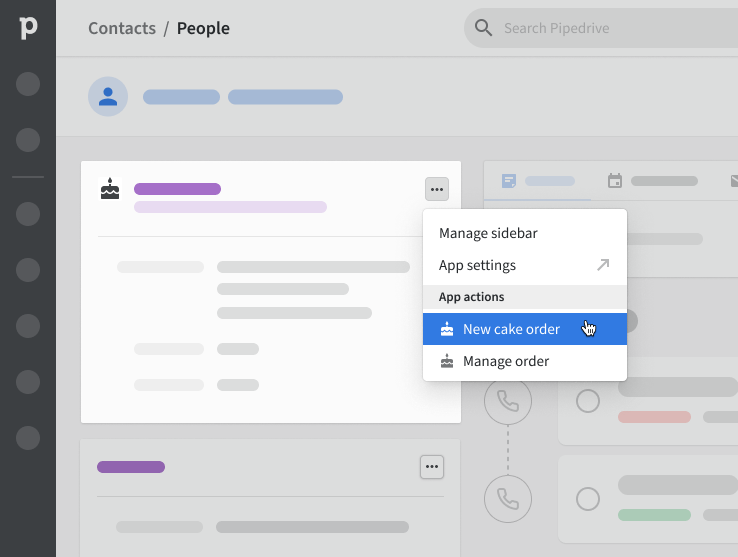
JSON modal is triggered from the JSON panel
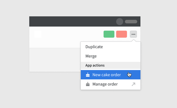
JSON modal can be triggered from the three-dot actions menu. Link app action shown with an arrow.
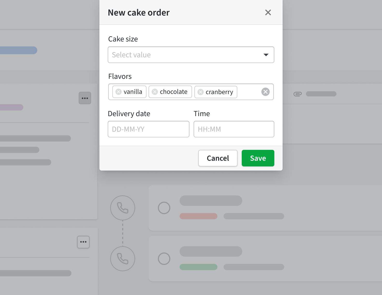
The JSON modal is displayed after the action is clicked
The structure of the JSON modal
The JSON modal will display a modal container after it has been triggered. Each modal can contain up to 8 UI elements called blocks.
Key terminology:
Container - A base UI element that will include smaller, customizable elements to show app information
Modal - A modal is currently the only container offered. Its base layout is non-configurable. Each JSON modal action can display one modal, and each modal can contain up to 10 blocks.
Components - UI elements that can be added to the JSON modal, e.g., blocks and action buttons
Blocks - Smaller UI elements that can be included inside a modal, e.g., texts, multi-select, etc. The full list of available blocks is available here.
Modal form - A combination of information and blocks displayed inside the modal
Action buttons – Buttons in the footer of a modal that trigger the modal’s action, e.g., submitting, resetting, and cancelation
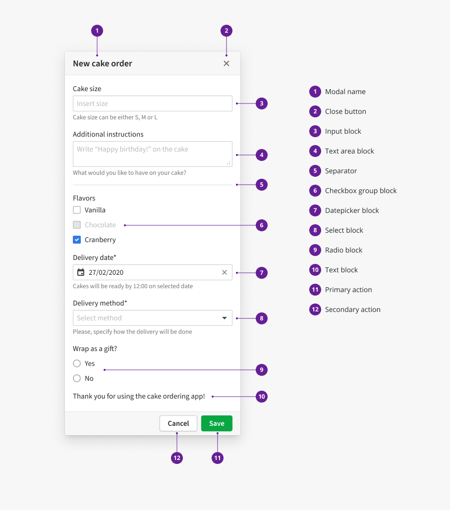
The structure of the JSON modal
How to create a JSON modal?
Key steps
-
Plan out your use case
-
Map your use case with the most suitable blocks for your modal – see component library for a full list of available blocks and how to add them to the schema
-
Create the schema. Validation of the schema can be done in Developer Hub.
- Configure an API endpoint on your side to respond to Pipedrive’s request. The endpoint should be able to respond/return different sets of data based on the user's input choices.
-
Configure the JWT token. The JWT token is used to secure the requests done from the JSON modal. We send the security token on each request. The JWT token can be decrypted with one value on the app's side. When combining your JSON modal, you can also specify a JWT secret value to the requests by adding it under JWT secret in Developer Hub. If no JWT secret is added in Developer Hub, we send the client secret as this value by default.
-
Add your JSON modal’s schema to Developer Hub. If you already have a live app, please create another test app to test the JSON modals.
Adding the action in Developer Hub
In Developer Hub, click on your app’s name and go to the App extensions tab.
In the App extensions tab, click “Add JSON modal” in the JSON modal section to access the form. Fill in the JSON modal's name and the rest of the relevant fields. Once you’re done, click “Save”.
Field | Description |
|---|---|
Action name (required) | The name of the app action. Descriptive, max 30 characters. The name will appear in the Features section of your Marketplace app listing. |
Action description | To showcase the interactive features of your app, your action’s name and description will appear in the Features section of your Marketplace app listing. Use the description field to let users know what they can do within this action. Optional; max 150 characters. |
API endpoint URL (required) | All API requests related to this action will be sent to this URL |
JWT secret | Optional. Defaults to |
JSON schema (required) | The JSON schema for your JSON modal |
Locations (required) | Maximum three app extensions per location. Each app can have a total of 21 app actions or custom modals. See more about available locations in app action’s visibility. |
Schema
JSON modal schema
The following example is the complete schema for the sample modal shown in the modal structure section above.
The JSON schema consists of a mapping of all blocks and actions that will be displayed in the JSON modal for the user.
- Learn about which components to add and what options they offer in our component library
- Find out how to display success and error messages inside the modal in our user interaction handling page
{
    "type":"object",
    "properties":{
        "blocks":{
            "type":"object",
            "properties":{
                "block_key_cake_size":{
                    "$ref":"#/definitions/element-input",
                    "options":{
                        "label":"Cake size",
                        "placeholder":"Insert size",
                        "message":"Cake size will be either S, M or L"
                    }
                },
                "block_key_textarea":{
                    "$ref":"#/definitions/element-textarea",
                    "options":{
                        "label":"Additional instructions",
                        "placeholder":"Write \"Happy Birthday!\" on the cake!",
                        "message":"What would you like to have on your cake?",
                        "resize":true
                    }
                },
                "block_key_separator":{
                    "$ref":"#/definitions/element-separator"
                },
                "block_key_flavors":{
                    "$ref":"#/definitions/element-checkbox-group",
                    "options":{
                        "label":"Flavor",
                        "value":[
                            "cranberry"
                        ],
                        "items":[
                            {
                                "value":"vanilla",
                                "label":"Vanilla"
                            },
                            {
                                "value":"chocolate",
                                "label":"Chocolate",
                                "isDisabled":true
                            },
                            {
                                "value":"cranberry",
                                "label":"Cranberry"
                            }
                        ]
                    }
                },
                "block_key_delivery_date":{
                    "$ref":"#/definitions/element-datepicker",
                    "options":{
                        "label":"Delivery date",
                        "value":"2020-02-27",
                        "message":"Cakes will be ready by 12:00 on selected date",
                        "placeholder":"Date",
                        "allowClear":true,
                        "isRequired":true
                    }
                },
                "block_key_delivery_method":{
                    "$ref":"#/definitions/element-select",
                    "options":{
                        "label":"Delivery method",
                        "placeholder":"Select method",
                        "message":"Please, specify how the delivery will be done",
                        "isRequired":true,
                        "items":[
                            {
                                "label":"Standard",
                                "value":1
                            },
                            {
                                "label":"Accelerated",
                                "value":2
                            }
                        ]
                    }
                },
                "block_key_is_gift":{
                    "$ref":"#/definitions/element-radio-group",
                    "options":{
                        "label":"Wrap as gift?",
                        "items":[
                            {
                                "value":"yes",
                                "label":"Yes"
                            },
                            {
                                "value":"no",
                                "label":"No"
                            }
                        ]
                    }
                },
                "block_key_info":{
                    "$ref":"#/definitions/element-text",
                    "options":{
                        "value":"Thank you for using the cake ordering app!"
                    }
                }
            }
        },
        "actions":{
            "type":"object",
            "properties":{
                "cancel_action":{
                    "$ref":"#/definitions/action-secondary",
                    "options":{
                        "label":"Cancel",
                        "handler":"cancel"
                    }
                },
                "submit_action":{
                    "$ref":"#/definitions/action-primary",
                    "options":{
                        "label":"Save",
                        "handler":"request"
                    }
                }
            }
        }
    }
}
JSON modal's data exchange on opening the modal
The user flow interaction will go as follows for the JSON modal:
- The user opens the three-dot/actions menu and clicks on the “New cake order“ action
- A modal appears based on the JSON schema added to Developer Hub for the JSON modal
- Initial request will be sent to the endpoint that was set as an API endpoint in Developer Hub
All requests from JSON modals contain the same query parameters as link actions -
resource,view,userId,companyId,selectedIdsplus additionalform,invoker(see component library), andtoken(encrypted JWT token value).tokencontains encrypteduserIDandcompanyID, so you can verify them from the query parameters.
The response to the initial request should be formatted accordingly to the JSON schema data structure uploaded in Developer Hub.
The response for the initial request can be used for:
- Simply acknowledging the request,
- Setting default values for the inputs
For example, the response for a schema could be as follows. The response can partially include options for dynamic data, such as "items" and "value" for different blocks. The options will be merged with the uploaded structure by block key defined in the schema and used in API response in the path /data/blocks or /data/actions.
{
    "data": {
        "blocks": {
            "block_key_delivery_method": {
                "value": 1,
                "items": [
                    {
                        "label": "Standard",
                        "value": 1
                    },
                    {
                        "label": "Accelerated",
                        "value": 2
                    }
                ]
            },
            "block_key_is_gift": {
                "value": "yes"
            }
        },
        "actions": {}
    }
}
The schema will now show the "standard" delivery option as a preselected value for select block and "yes" as a preselected value for radio group block.
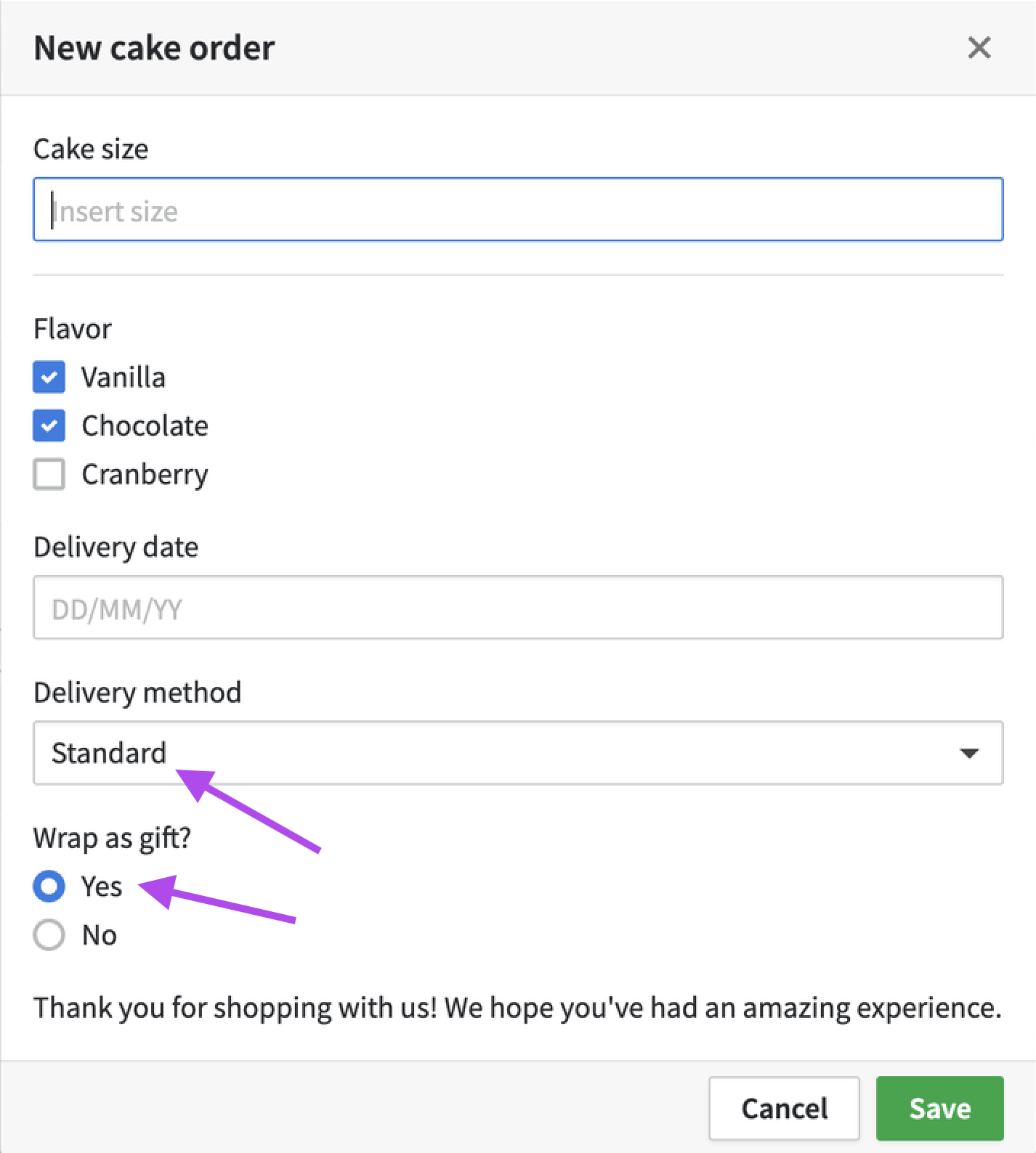
Or the response could be returned with a "data" property that is required, and the "blocks" array and "actions" array can be left empty, as the response will be merged with the already added schema definition in Developer Hub and displayed as it is.
Response from the API endpoint
{
    "data": {
        "blocks": {},
        "actions": {}
    }
}
Here you can see, how the modal remained the same as in the schema definition, no new values were added.
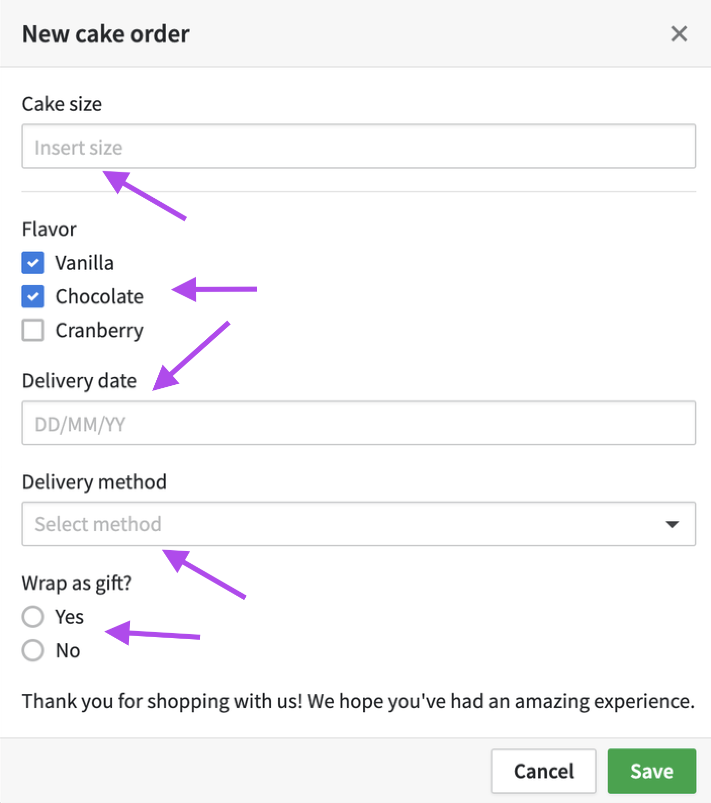
Please note that options from the uploaded structure and API response will be first merged and then validated altogether (see structure validation).
Schema structure validation
The response structure received from the app’s API endpoint can be incorrect. For example, this can happen when some options have an invalid value, a missing required option or, a block that includes an unknown additional option. In this situation, the user will see an error.
For example, the following data response will cause validation errors as willNotPass is an invalid option`:
{
    "data":{
        "blocks":{
            "input_item":{
                "willNotPass":true
            }
        },
        "actions":{
            "submit":{
                "handler":"invalid-handler"
            }
        }
    }
}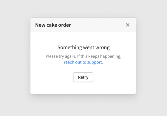
Modal validation error displayed in the modal UI
Actual errors won't be visible for users in the UI but can be checked in the Network tab in Developer Tools in your browser when you click on the error path.
If there is an error, troubleshooting can be done using the following parameters:
dataPathtells what block's data is invalidmessagecontains an explanation of why it is invalidparamsgives more context about the error
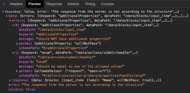
Troubleshooting errors in the Network tab under Developer Tools in your browser tab.
Schema data exchange on modal form submit
Your own destination URL can be defined in the uploaded schema for each primary action button. By default, the JSON modal URL set in Developer Hub will be used for all requests.
When all required fields are filled in, the user can submit the modal form (or open a new browser tab - depending on your action handler configuration).
Before sending the form data as a request payload, it will be collected from:
- All visible blocks
- Blocks with
“visibleOn”: “never”. These blocks won’t be visible to the users but allow you to send additional metadata to your service, e.g., data from fields of Pipedrive entities to save additional API requests.
{
    "block_key_input": "Some text value"
}
There are a few options for the following user behavior:
- in a positive scenario, the modal will be either closed with a snackbar notification shown to the user or a new browser tab will be opened (see Displaying success message).
- in a negative scenario, there are 3 different ways how errors and error messages can be displayed to the user (see displaying error message).
Updated 6 months ago
